Smartfoos 1: Case Study
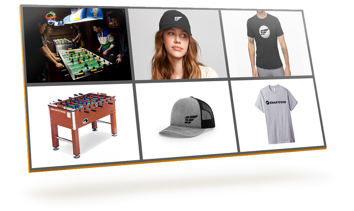
After watching a lot of foosball tournaments, I was amazed at the speed of the ball and how fast the athletes spun their wrists. That's when I knew I had to incorporate that into the brand.
My best work in Branding & Identity Design


After watching a lot of foosball tournaments, I was amazed at the speed of the ball and how fast the athletes spun their wrists. That's when I knew I had to incorporate that into the brand.

After pinning down all aspects of the logo, it's time to make sure all the visual math checks out.

These are all of the final logos against light and dark backgrounds.

Stakeholders really love it when you do this kind of stuff.

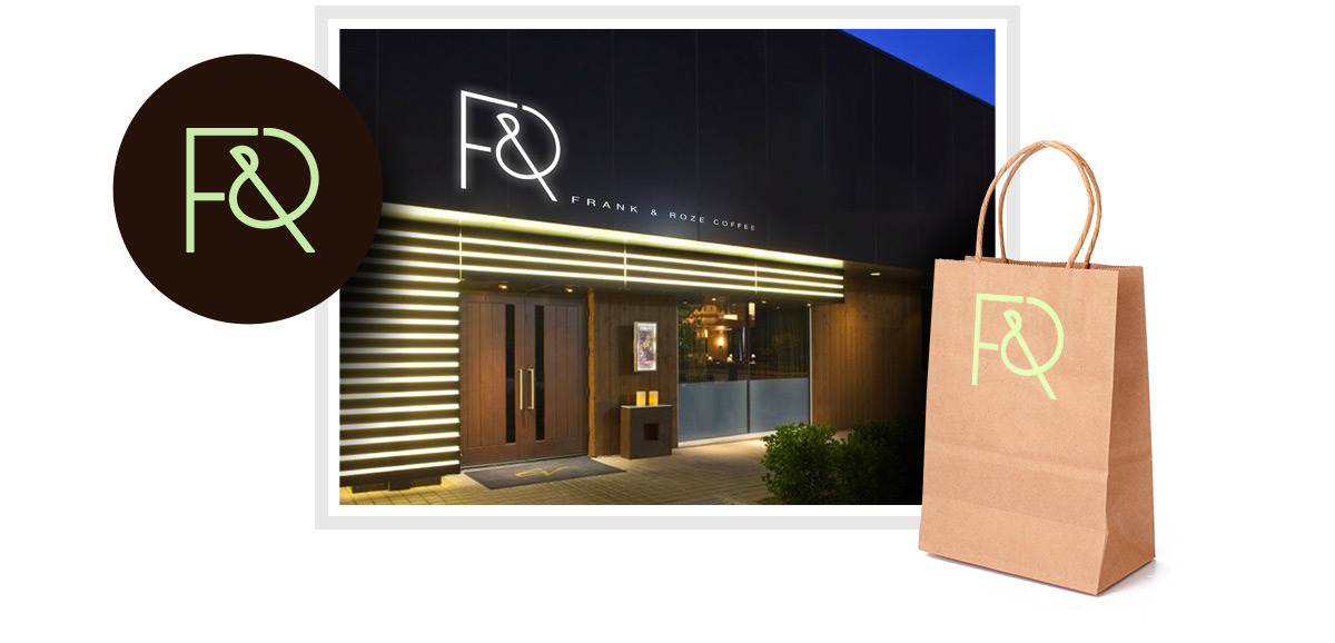
They wanted a version that was really "out there".

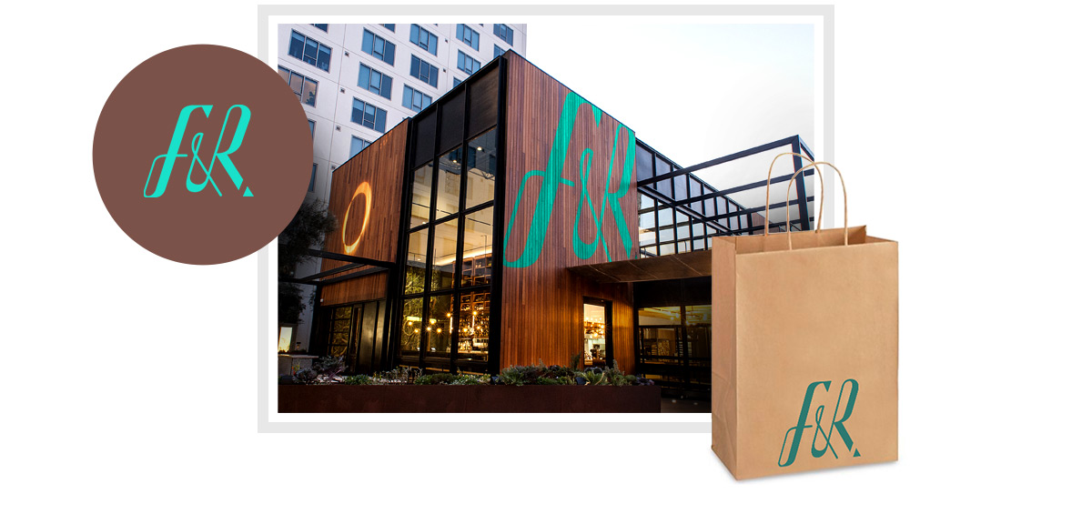
You don't make reservations at a coffee house, but if you did, it might look like this.

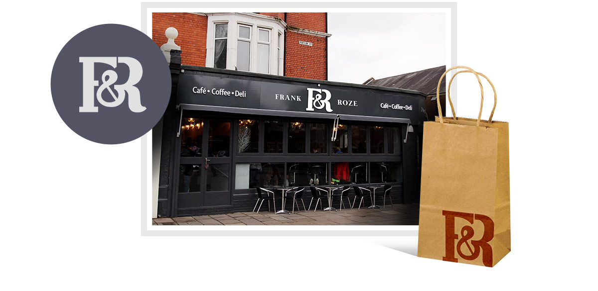
Do a "Parisian-like version...something that looks antique" they said.

This is the one that everyone like the most.

The 3 grayed-out logos were close contenders to be the final.

These were our business cards.

The running theme of the thunderbolt depicts the quickness in the delivery of our content and information.

Uninterested in giving his new business the conventional liquor store name, the client wanted me to conjure up something unique, so I made Mr. Tipple.

Hand-drew a different persona of Mr. Tipple that would resonate better for hot sauce.

Not trying to be biased here but these were really good.

I entered a logo contest and won with this. Little did I know that I was going to be doing a robust line of services for the client.


